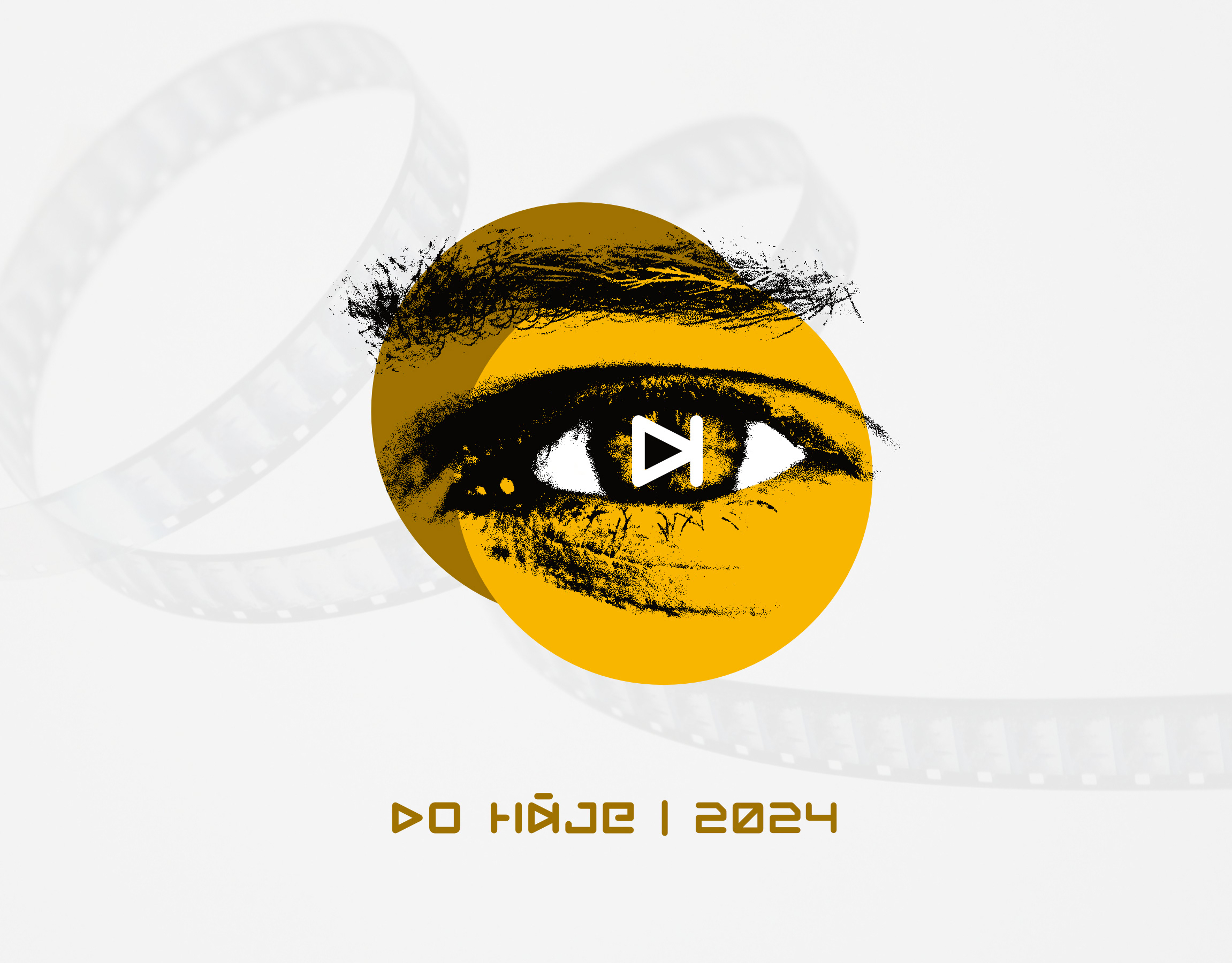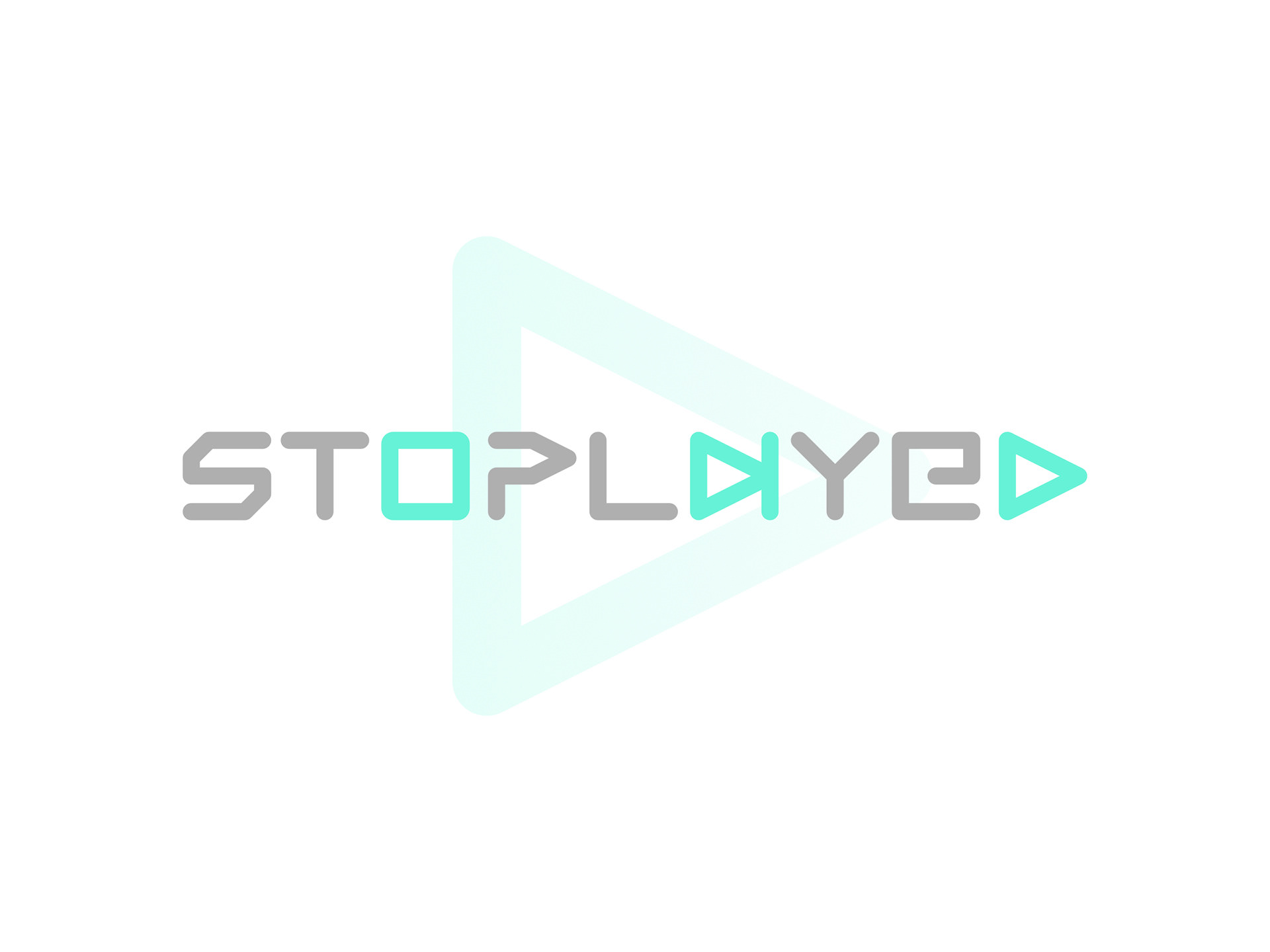
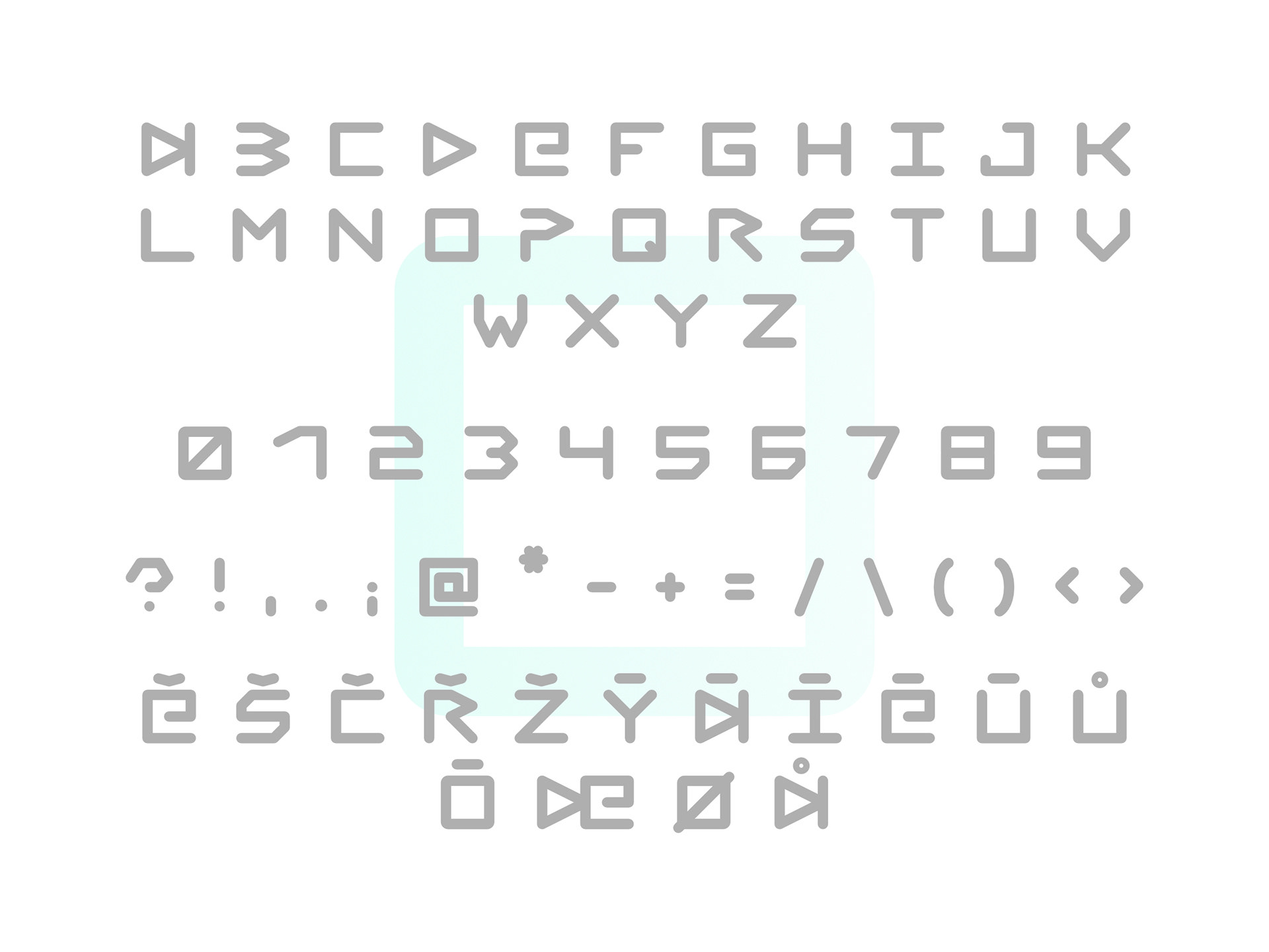
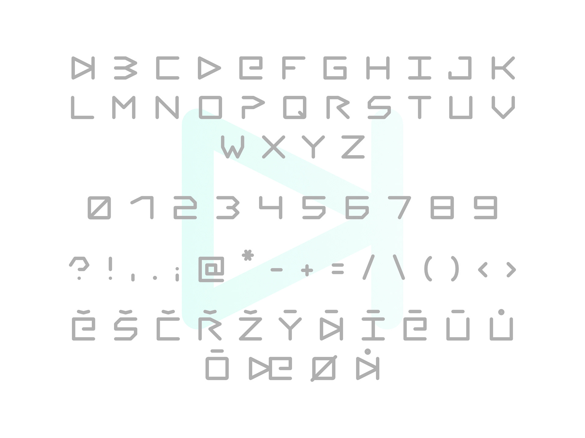
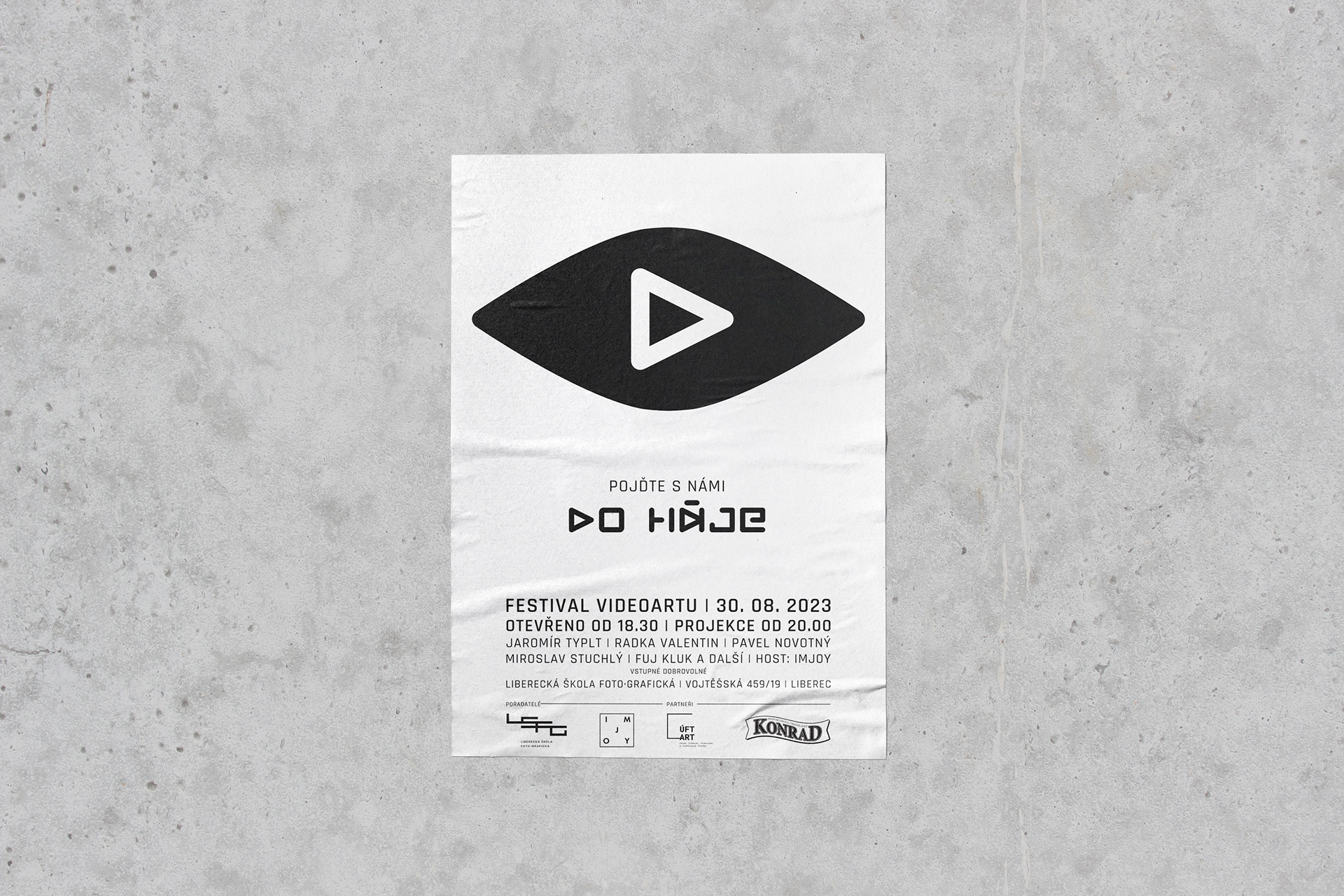
I created the typeface for a video art festival identity, inspired by the play, stop, and next symbols from video and music apps. The geometric simplicity and rhythm felt fitting for the theme, but the typeface quickly showed potential beyond the screen.
Because of its roots in music symbols, it works naturally with audio and video-based projects. Its bold, directional character makes it ideal for posters, album covers, or anything that plays with time, movement, and sound.
It is available in Regular and Light style.
Thank you for watching!
Would you like to work with me?
Contact me at eva.moricka@gmail.com